Project Background & Goal
ReSurge International has provided reconstructive plastic surgery services all over the world for close to 50 years. In 2017, they identified the need to create a more concise, visually engaging, and usable online presence in the hopes of bringing more people to their brand and increasing donations to this nonprofit. Working with their head of marketing, we set out to actualize a vision of modernity and bring ReSurge into the new landscape of web design.
DESIGN PROBLEM
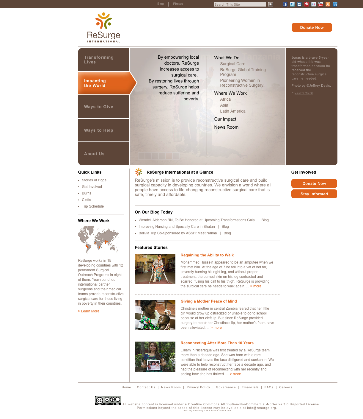
ReSurge’s preexisting site navigation system presented too many choices for users, creating a cognitive strain. The site accumulated new content over the years, without consideration for overall site architecture and general site usability. As a result, users could not navigate to specific content in an easy and logical way, which resulted in many leaving the site altogether.
DESIGN PROCESS
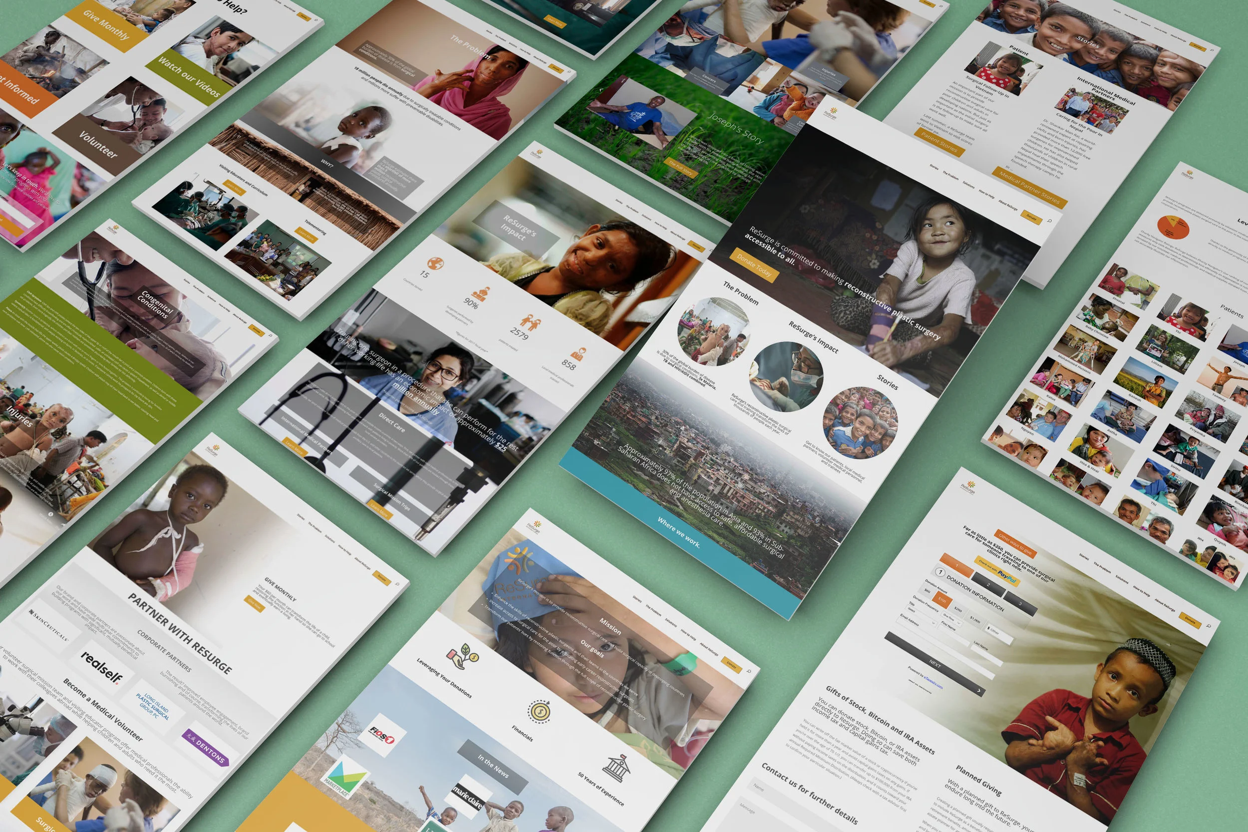
The priority was to create a simplified version of the site that highlighted the strength of ReSurge’s photographic content and inspired the user to take action, in this case in the form of a donation.
STEP 1: IDENTIFYING STRENGTHS
During the re-design, the power of the visual content became overwhelmingly clear to me. This content was leveraged along with key information and written materials to create a potent impact on site users.
Approximately 5TB of visual content was reviewed to find photos that would resonate with users. Many of the prominently featured photos on the website had not been changed in many years. Novel image selections were approved by both the head of marketing and the marketing board before they were used in the final site construction.
STEP 2: IDENTIFYING THE USER
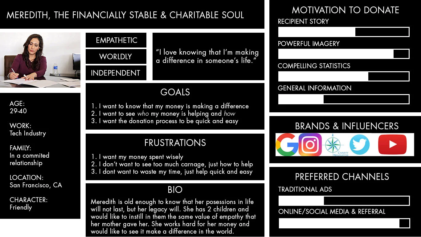
An analysis of ReSurge’s user data revealed that 64% of donations are made by women, and the bulk of users are 30 years of age and older. With this in mind, I created a persona based on our findings. This helped us empathize with the user during the redesign.
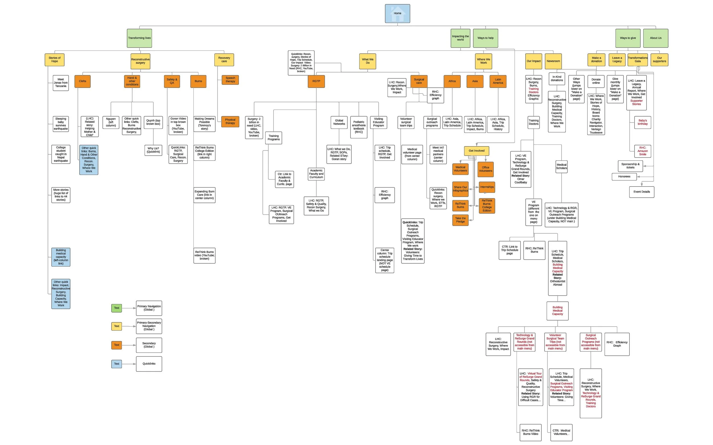
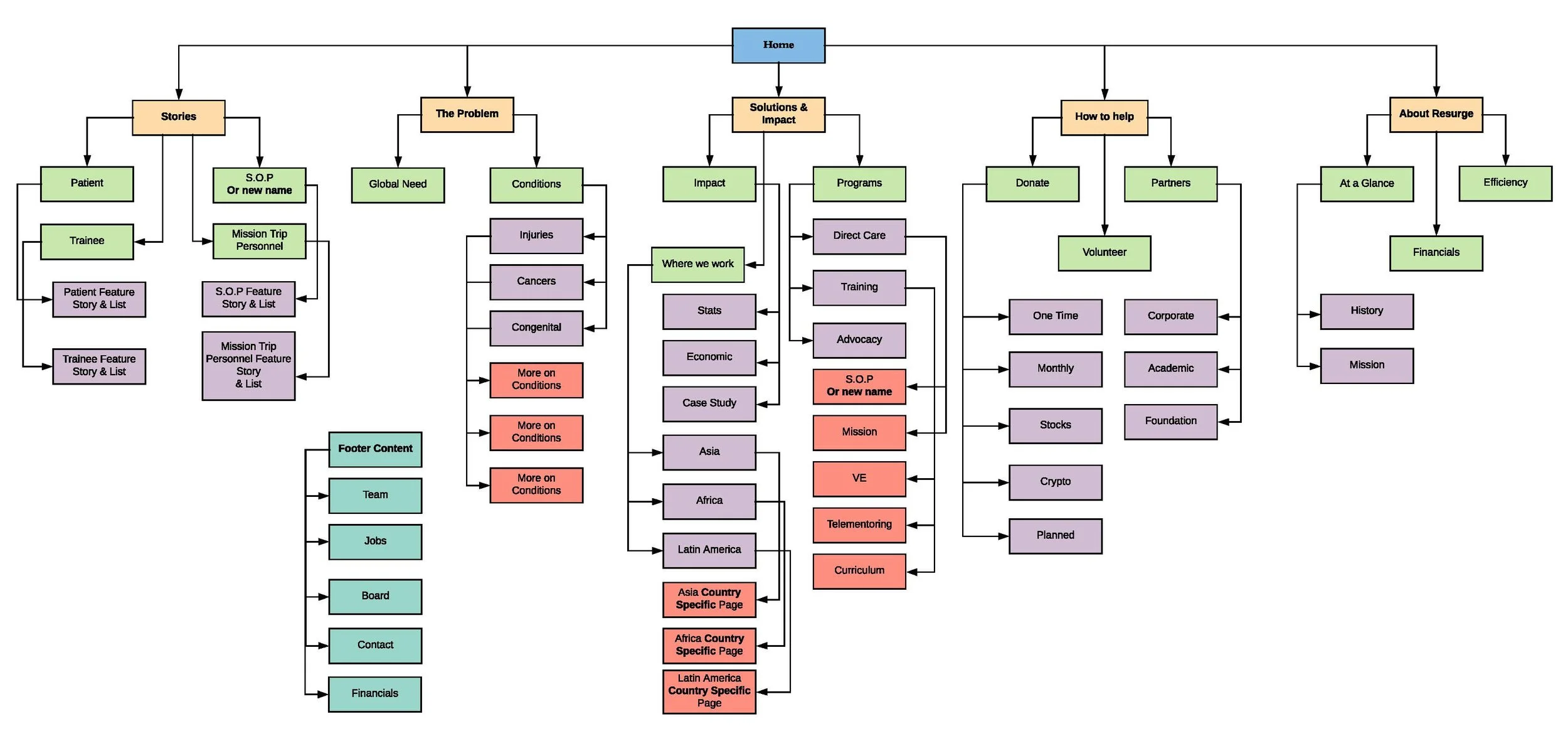
STEP 3: INFORMATION ARCHITECTURE
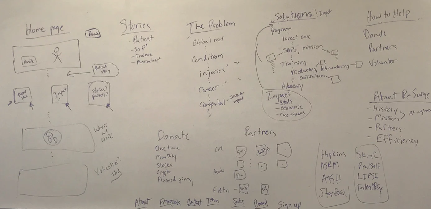
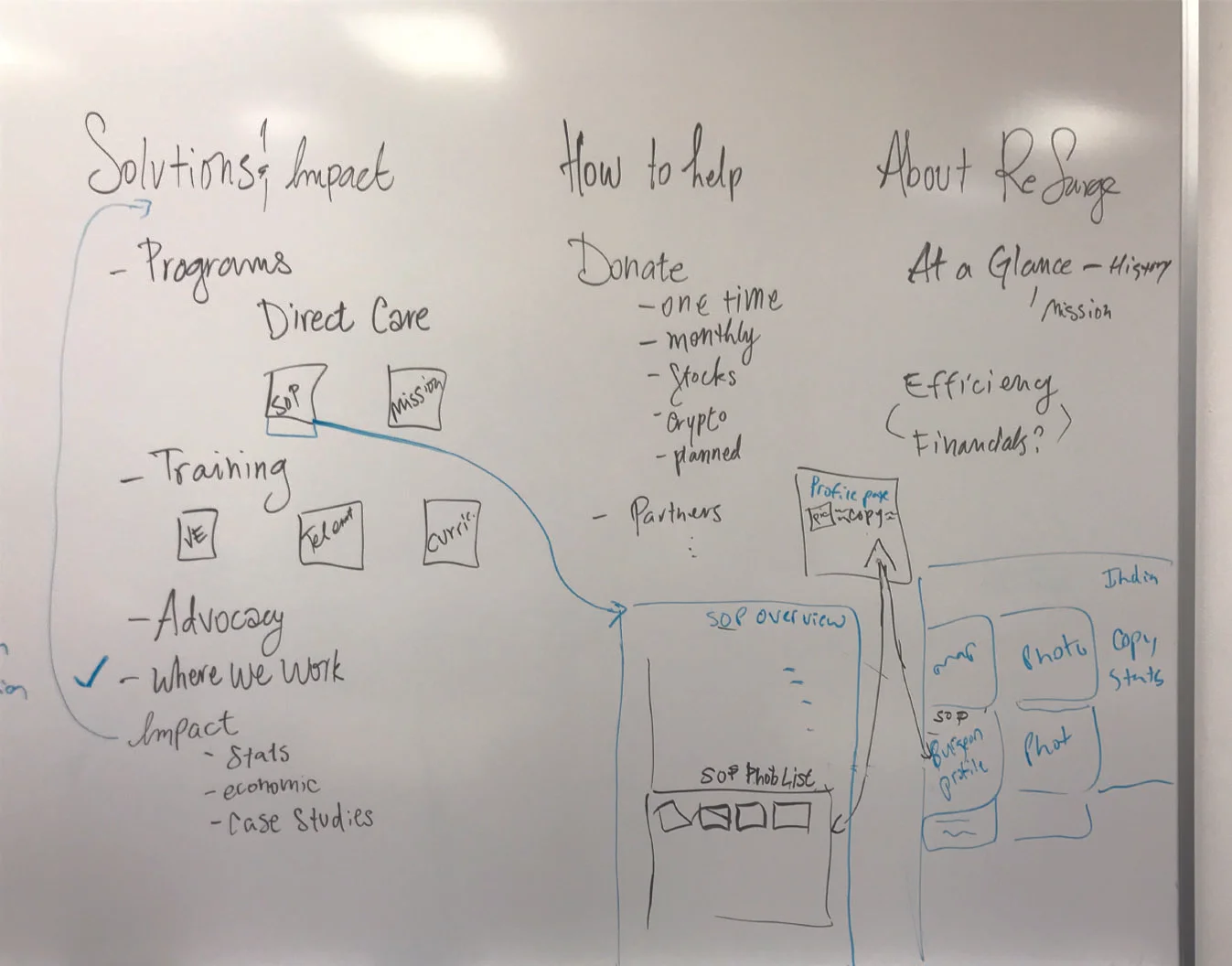
The site architecture and content were designed to portray a simple narrative. Navigation was created to identify the problem and show the impact that ReSurge has had on the world. By minimizing the number of clicks necessary to reach featured content, the user was able to choose when they wanted further detail, rather than being overwhelmed with information from the outset.
STEP 4: BEGIN MAKING low-fi WIREFRAMES
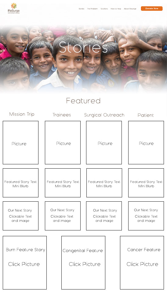
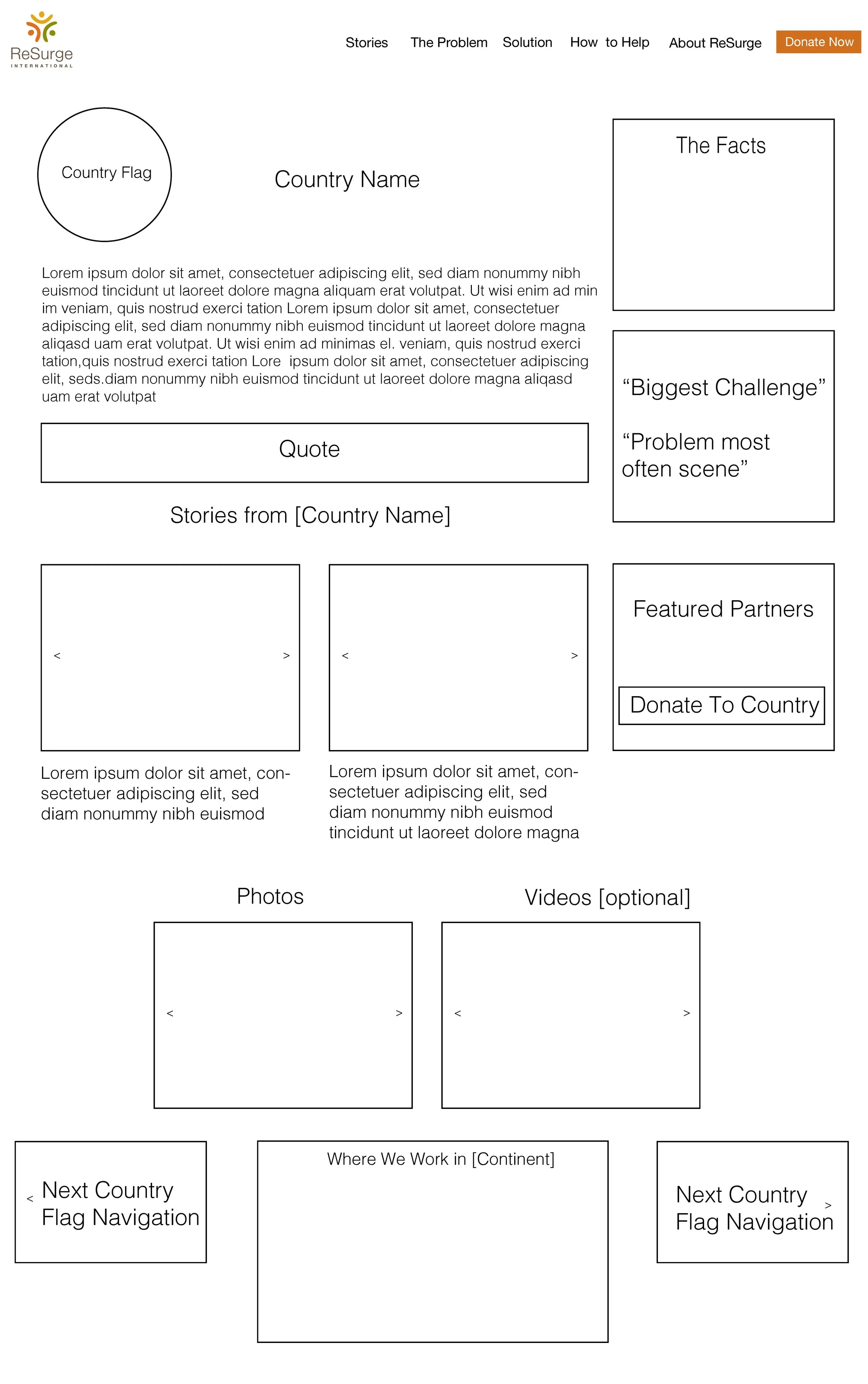
To create ease of navigation, I built wireframes of index pages and the navigation functions within them. The aim of these pages was to create a compelling narrative within each section and create a home from which users navigate to more granular, related content. Many of these wireframes were created before final photo elements were approved. Wireframes were also sent to the marketing board for final approval.
STEP 4: BEGIN MAKING Hi-fi WIREFRAMES
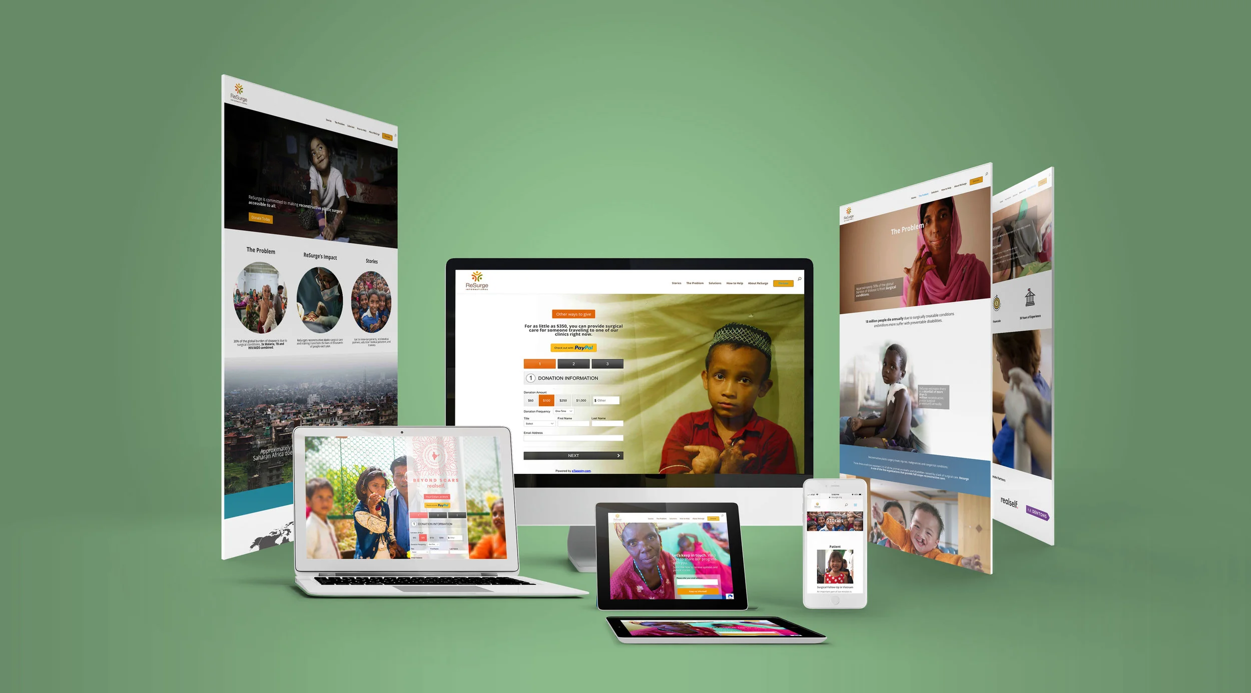
Once both the photo elements and wireframes were agreed upon, I began to create Hi-Fi wireframes. Moving towards the final formulation of the pages, they combined the new site navigation, the color palette, and the photo content that would be used in the final version of the website. At this stage we explored several different aesthetic directions, and finalized our choices.
OUTCOMES
ReSurge’s new site reduces cognitive strain and is geared toward making a stronger push for the user to take action by donating. The revamped site is image-heavy to showcase the excellent and moving photographic content at the organization’s disposal and keeps the bulk of text-heavy content lower down in the site hierarchy. This allows users to go from broad content to more granular content if they become interested in learning more.
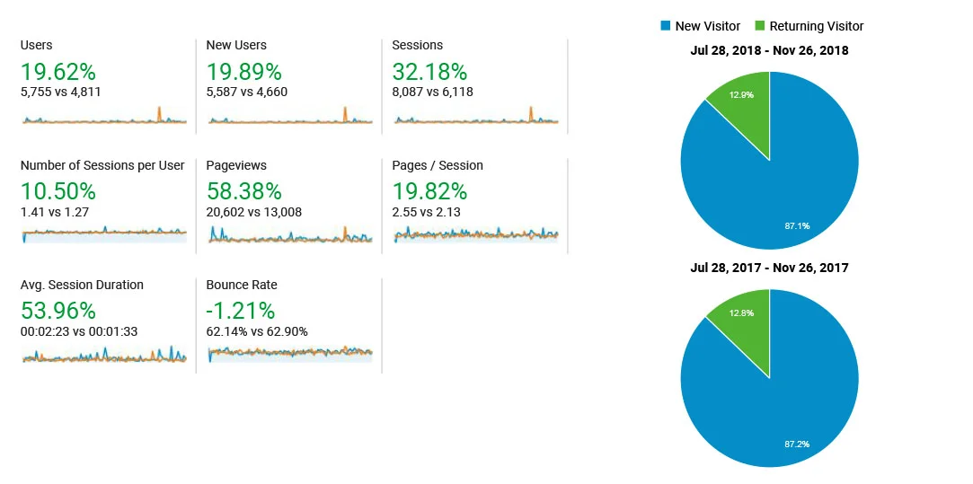
After building out the new website and pushing the site live, we saw a number of promising signs in the statistical user data. There was a nearly 20% increase in users. The creation of a new donation page empowered ReSurge to track conversions, which was originally not possible (this will be the true measure of the site’s success). Furthermore, we found that session durations went up by 50%, which speaks to a more engaging website. The bounce rate decreased as well.

