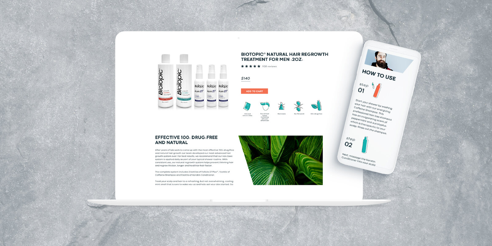
Building a brand
Biotopic exists in a crowded market space of male hair enhancement products. The owner wanted to create a more unique and competitive brand. The many natural ingredients used in the products already differentiated the company, but even within the space of natural hair enhancement products, Biotopic needed a cohesive brand aesthetic to gain customer trust and attain greater conversions.
Visual identity
After extensive buyer demographic research using customer form responses and one-on-one interviews, we were able to better understand factors driving conversion. Natural ingredients were the most impactful selling point and the key demographic was men between the ages 25 and 35. Therefore, we began creating ad content to test how to better target this group. By experimenting with different google ads, social media ads, and AB testing of landing pages, we identified the most effective CTAs, colors, and imagery. As conversions increased, the visual identity for the site redesign came into focus.
Custom Icon Set
We created an icon set for use in email marketing, social media, and on the website, that resonated with key demographics and matched the company founders’ desire to shift the brand for the possible inclusion of a product line for women. These changes were a departure from a very info-heavy and hard lined visual approach that gave the site a sterile and clinical feeling that did not resonate with customers. The new site utilized more white space, illustrations, and natural backgrounds. These choices solidified the natural elements integral to the brand and appealed to younger demographics, who were not served by the previous look and feel of the site. We did not create a hyper-masculine icon set due to our data-driven demographic studies and customer surveys.
RESULTS
After implementing these changes, we saw a 13% increase in the conversion rate, a 30% increase in the email click rate, and a 20% decrease in the abandoned cart rate!


